“The ultramodern way to bring entertainment to your apparel expression.”

Watch it in action
Case Study
Role: Lead Visual Designer
Duration: 2 weeks
SUS score:
Starting Score- Average: 66.67
Ending Score- Average: 85
Meet the Team

ME


Let me catch you up to speed:
Myself and two teammates John Starnstorous and Morgan Long took part in a two-week design sprint with the goal of making a new feature for Nordstrom’s™ current IOS application. We were tasked to stay within the parameters of keeping Nordstrom™ customer experience social and shareable, with those set objectives we made it a top priority to keep our goals consistent throughout our entire sprint and always kept our users top of mind.
John
Morgan

Lets get into it
Identifying the Problem:
How can we bring together a cohesive reality with online shopping and a shared social experience?
Goal:
We wanted a way to implement a smooth and seamless addition by creating a social sharing feature that will give users the ability to get inspiration from their
My Role:
Throughout the project I wore a few hats, but my main role was being the lead visual designer. I found myself often being a strong team player and trying to be a crutch of moral support, as well as oftentimes trying to alleviate situations where we started to feel stressed by being a mediator, and the use of a little comedy
Here a few of the tasks I completed from beginning to end
The pink items Ive described below to help showcase my skillset!
-
Statement of work
-
Key UX metrics
-
Customer journey map
-
Customer Task Analysis
-
Scenarios
-
User Stories
-
Storyboards
-
Design Studio
-
Prototypes 1, 2,&3 (Figma)
-
Concept map
-
Visual Design
Creating a customer journey map:
Why this was important:
Being able to help our team empathize with the user, is a large part of what it means to be a UX desinger. I did that by creating a customer journey map, in this situation we follow our persona "Mia" through the task of what it is like to currently buy a pair of boots through Nordstroms IOS app. I found a few common pain points throughout our user interviews. which allows us to see the areas in which we can better their experience.
Building from there:
Task analysis
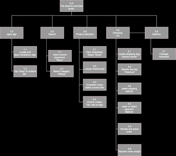
Why this was important:
The ability to map out what it would look like to follow a task is a great to help UX designers see where the can better implement the RIGHT was to create the design to better. In our case the exisiting task analysis
The beloved design studio
The use of teamwork and multiple rounds of iterations are what makes a design studio successful.
What our final idea came to be:
After 4 rigorous rounds of iterations that consisted of 5 minutes of isolated design, we grouped back into a team to discus the positives and negatives of our designs that have been put on paper, we did the same process 3 times, and finally met together at the end to create a cohesive design


Key findings:
One of the most important factors that i gathered from interviewing was that customers LOVE filters, and the ability to be in control of what it is they are being shown, i found that it would be important not only for retail items but for the people who are on your feed as well.
The ability to personalize and be in control of multiple aspects of your experience was always top of mind for me while creating.
My implemented designs:
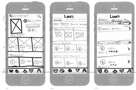
Through the rounds of iterations there were a few of the designs that made the final cut came from my sketches, the use of having a personal profile similar to many other social media platforms, and the ability to incorporate numbers to each user for the ability to few personal analytics.
Visual Design:
The Abundance of iterations made:


An important iteration was to take the social sharing feature to the top for information hierarchy-
The need to make the action buttons less, of "in the work" feel and make them seem more modern and on brand with who it is that Nordstrom embodies.
Allowing the user to have a pop of color to draw their attention to go want to go and explore further


The headers for the top nav bar was an important finding through usability testing
Removing the thick boxes, led to a more modern and higher-end feeling.
Following the same reasoning behind make the Hi-Fi look more polished and finished I found the need to make the nav bar more
The concept map:

Why this was important:
From a visual standpoint the use of concept map is a nice and simple way to clarify what it is that you've made a priority during your project, you can look back at what your made the biggest priority and check back in with both your business and team goals to once again make sure that you are designing for the RIGHT reasons.