
City of Seattle Innovation & performance
"Guiding the youth of today, to achieve their goals of the future"
Check It Out
Meet the Team
Case Study
Role: Information Architect
Duration: 4 Months
Starting SUS score: 52%
Ending SUS score: 75%

Me

Jay-kwon James

Jennifer Dame
What our team was tasked with
The City of Seattle reached out to our team to do user research and a full portal redesign on the un-launched Innovation & Performance Youth Portal.
We were tasked with the a few questions in the very beginning: "Are we missing any target audiences?" How can we create an aesthetic that is not so government official" and the most important being "would people even use this?"
With our project brief and introduction we got started! As project manager I created a functional team plan and a RACI roadmap to keep track of our progress!
With a good foundation in place it was time to dive in. This project had a lot to do and we did a good amount together developing an important team functionality skill, but to show you my skills follow me through the list of deliverables that i was in charge of!
Deliverables I was in charge of creating
1. RACI Roadmap
2. Statement of work
3. Card sort
4. Affinity Diagram
5. Persona
6. Concept map
7. User journey
8. Sitemap
9. User Flow
RACI & Roadmap
A skill that I have come to appreciate in projects that are done in teams, I find being able to lay out "time-boxed" goals for yourself and points of contact for times you have any blockers, as well as the ability to have one sheet that has all the answers to refer back to has surely become one of my personal favorites in the realm of project planning.

Affinity Diagram

Affinity Mapping a crucial part of the UX design process, it gives you the ability to create trends out of all your user interviews which i find truly so interesting. For this project our target
audience was teens ages
14-20. We also wanted to make sure that we weren't missing out on any target audiences so we interviewed a few "non traditional" teachers and counselors.
We found 20 initial trends but chose 4 that fell under the target problems of this redesign.
They were,
1. "I want to find specific programs tailored to my needs and interests."
2. "Not everyone benefits from the traditional education system"
3. "I want access to mental health services offered outside of my school."
4. "I want a wat to find mentorship opportunites"
Problem Statements
We then used that as our base of composing a couple potential problem statements. Below are the two that we decided were concrete for this project.
1."I don't currently have a way to access programs or tools to be traditionally successful discovering my career path."
2. "I want to be able to search for resources that can help me be successful right now!"
Persona

Using the findings from the affinity diagram and the problem statements above it was to time empathize with our users. Personas are a good way to do that, giving a face to the target audience and seeing them as people just like we are. It's so important to never forget that you're not designing for yourself or for a company but for the users needs. Based on the target demographic we were given in the beginning of this project, meet Alyssa a 16 year old high school student who comes from a low-income family and often struggles with self worth identity. Throughout the design process it is impactful to go and look at the face your are trying to solve for. With a good understanding of who what and why were creating this portal redesign it was time to make a concept map to show what i valued in this project. Find out more about that below!
Concept Map

One of my favorite parts of creating a concept map is the ability to use them a visual touchstone throughout the design process to make sure that you creating the right thing for the right reasons! In this project the main concepts that I came out with were overall and most important "teen life success" as well as a heavy importance for creating a sense of direction, hope, and help for the underprivileged youth. This Concept map was admired by the client and that was even more of a reason to continue to utilize this map throughout our project.
Card Sorting
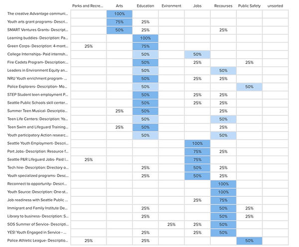
Choosing to start with just the original programs that are currently listed I conducted a card sort to see where a few users would think to find these programs. A few of the programs had overlapping categories and that was an initial finding that some people were torn about how to categorize them into certain groups.
Using my findings as a good foundation I got to work how to better present this information to the user, and paused with the information architecture to create a user journey to find out what was going to be expected of a City of Seattle Youth Portal User. Find out more about how I did that below!
User Journey
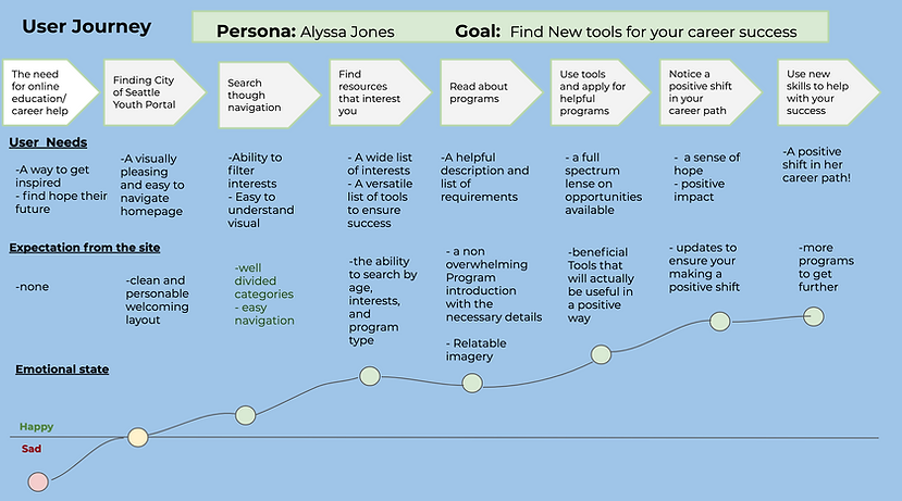
Understanding the importance of every part of a users journey is key to creating good solutions. Above is a created user journey that I made to better understand where user pain points could arise with the current redesign ideas. I knew that there were a few things that were inevitable to avoid, because of the amount of external links with layouts and content that I could not change. So i focused in on truly what was expected of the sides that we were able to control. I found out that above all else I needed to create this site to be relatable to the youth of today, and from our interview findings I knew that could potentially be challenging because there is a large disconnect from adults and the youth with a large amount of them feeling worthless and unworthy of a higher path. The heartbreaking reality of that made the need to create a meaningful and usable portal even more important to me. Mapping out all of the importance pieces of what would be expected from our portal, and creating a path to a foreseeable "happy" path it was now time for me to lay out where all of our content would live.
Find out more about how i did that below!
Sitemap

Sitemaps are incredible tools to be able to visually see where all of your sites content will live, and to make sure that looking at all the information overall everything seems to be distributed in the correct manner. As a team we conducted a design studio to be certain of what we wanted our top nav bar to include, and used that to create core of our navigation. The three topics we set on were
1. Build your Future
2. Recourses
3. Opportunities
From there it was important to go back and take a look at how programs were categorized in the card sort to make sure that there was clear functionality of the sites content.
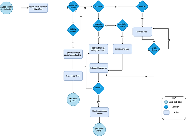
User Flow
.png)
The use of creating this user flow diagram was of large importance, I created a series of scenarios that could be utilized throughout the youth portal. My first user flow was for the process of searching for a program using filters of interest and age. To then sign and fill out needed applications, and all the steps you would have to go through to be sucessful in doing so. There is a another path that you could take with the user flow to finding a career
Next Steps
As a team we thought out a number of steps that we found to be crucial to the portals success, first and foremost making sure that this web design can be fully implemented into a responsive design! As well as conduct a few more usability tests to ensure our design has fixed or at least opened up the opportunity for the underprivileged youth! For me personally I have many next steps that I would be interested in taking to ensure i've done everything that I can to create features and functionality that will help the underprivileged youth of Seattle.